Most people may not know his name, but they absolutely know his work. Drew Struzan, the legendary movie poster illustrator, passed away this week at the age of 78 and after a long and lustrous career of crafting some of the most iconic one-sheets and box covers ever. To pay him tribute, here are some of our favorites from his work:
Justin: I feel that I could write a long-form essay about how Drew Struzan WAS the movies to me — and probably always will be. He graced some of the all-time best movies from the ’80s, ’90s, and 2000s with art that became synonymous with that film. I have a dream of eventually buying and framing a number of Struzan prints for a movie room, but the question is, which ones would I choose?
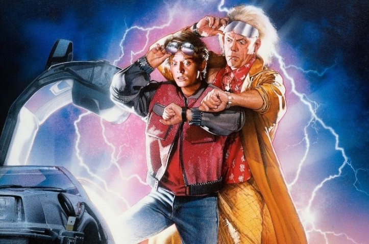
I have a lot of favorites of his, including The Goonies, Adventures in Babysitting, Indiana Jones, Mallrats, more ’80s comedies that I can count, and, of course, the Star Wars saga. But if I had to narrow it down to just one poster above them all, it’s Back to the Future Part II. All three posters from the series go so well together, but the middle one is the best with the flying DeLorean, Doc Brown joining Marty, and the futuristic outfits. It’s absolutely gorgeous in all of its detail and dynamism — including how Marty’s leg disappears into the bright light of the car interior like he’s either exiting or entering its domain.
Wolfy: Boy, where do I begin? It really is not hyperbole to say that Struzan’s poster designs are part of the mystique and allure of movies for me. His work made these things collectible and films exciting.
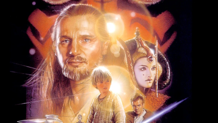
If I had to pluck one, though, I would definitely say the poster he made for The Phantom Menace is at the top — or at least tied among the tops. It evoked some of the original trilogy’s posters while enticing and teasing all of the incredible visuals you would expect out of a Star Wars film. Truly one of the best compositions in the medium.
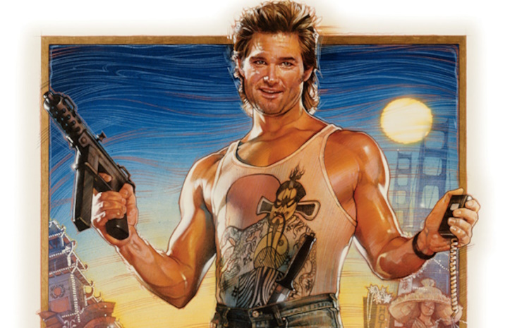
Kristi: While this is my absolute favorite movie for many reasons, Struzan brought the movie to another level through an impeccable poster for Big Trouble in Little China. Jack Burton towers over everyone, while Gracie Law and Lo-Pan flank each side. The colors were vivid and painted a scene that even non-John Carpenter fans couldn’t ignore.
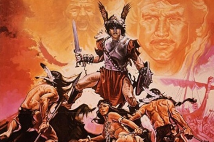
Sitting Duck: Drew Struzan has quite the selection of poster art, with franchises like Star Wars and Indiana Jones being represented. I could go with one of those. That would be the easy way. But it wouldn’t be The Mutant Way. With The Mutant Way, you go with the disreputable trashy schlock alternative.
And they don’t get much more disreputable, trashy, or schlocky than Deep South auteur Charles B. Pierce of Boggy Creek notoriety. So I went with Struzan’s poster for The Norseman. Like any good poster, it conveys the basics of the film’s premise. We’ve got ourselves a bit of text at the top to set the mood, an inexplicably pantsless Viking whose helmet sports wings instead of the traditional horns, and a couple of tribal warriors who look like they’re ready to skewer him. There’s also a native lady who is enduring what looks to be a rather uncomfortable wedgie. From this, we can discern that there will be a violent clash between two cultures and maybe a bit of nudity. Because even though the flick is rated PG, it’s a 1970s PG.
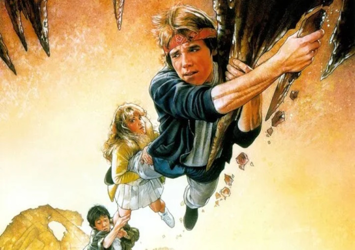
Heather: My favorite Drew Struzan poster is the one for The Goonies. I love the cool perspective of looking down on the cast as they hang on for dear life. It’s almost like you could reach a hand down to help them out, which they’re gonna need since one of those stalactites just broke of in Brand’s hand.
Want more Drew Struzan? Check out our write up of him in our Cult Hero of the Week from 2011!

Struzan is the master.
Here’s another connection between Charles B. Pierce and Star Wars. The posters for The Town That Dreaded Sundown and both Boggy Creek flicks were drawn by Ralph McQuarrie, who is probably best known for his Star Wars concept art.